
Overview
As an SVC class project, I was tasked with crafting the web experience for the first Upstream Music Fest + Summit. The brief and brand assets were provided by the client, Vulcan. Check out my approach below.

The Challenge
The objectives of the project were to inform site visitors and create a sense of excitement around the new festival, drive email sign-ups, and ticket sales.
The fact that this was the festival’s first year brought unique challenges and constraints. This would also be a first impression for much of the audience looking to find out more about the event.
Role
Visual Design / Brand Extension / Site Architecture / Ticket Purchase UX . Presented final design to class & client.
Approach
Brainstorming
After studying the brief, I decided my main goal was to blend a sense of fresh vibrancy with a feeling of smart authenticity, to bring excitement and curiosity, as well as credibility to the festival.
To kickoff ideation, I started with some key terms from the brief, and extended the word list in the form of small mind maps, to create more of a lateral and divergent group of concepts to explore further and keep on-hand as reference as the project moved forward.

Visual Reference: Who / What / Where / When
Pulling out some selected terms from the brief and mind-mapping exercise, I decided to collect and group some key images that would provide good visual reference for the setting, subject, and audience.


Moodboard
One of the words that stuck out from the mind map exercise and reference was “brick”, and how that could connect a lot of key attributes such as authenticity, connection, joining, and rhythm.
Combined with the adjacent idea of “mural”, this would create a nice reference to Pioneer Square, and allow me to focus on a graphic and type-driven approach that would help make up for the lack of photographic assets.

Sitemap
In parallel with starting the visual design phase, I laid out the site architecture, taking into consideration the main objectives of the project (create interest, drive sign-ups, and ticket sales) and goals of the user (find out about the festival, sign up for updates, and buy tickets).

Visual Design
After a bit of sketching, style boarding, and iterating, I quickly finalized the look and feel of the site based on my “mural” moodboard. This solution focuses on large and bold type treatments and vibrant color palette overlaid on the faded fish graphic, combined with a wave/vibration element and white-washed brick to bring a nice blend of freshness with authenticity and a sense of setting. This approach also brings visual interest without relying on photography which was a practical project consideration.

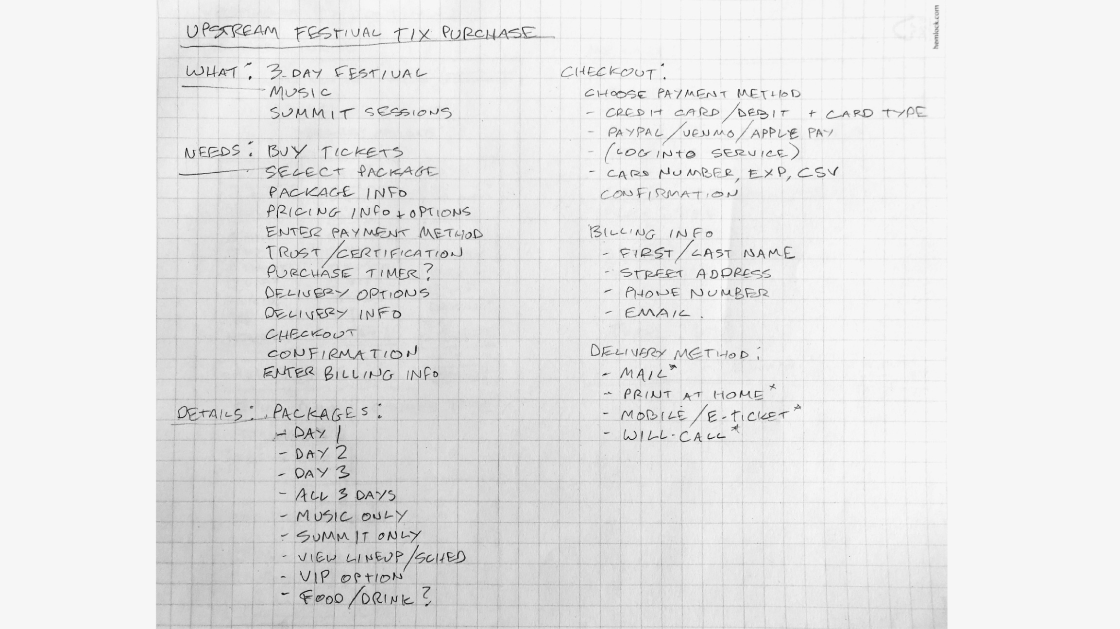
Ticket Purchase Exercise
As an extension of the main project, I wanted to explore solutions for the ticket purchasing experience. I limited myself to the length of the newest Gorillaz album I played while working, which is 40 minutes (give it a listen when you get a chance).
I started with writing out the main subject, then dove into the main information, tasks, and inputs that the user would need to complete their informed purchase. After creating a pretty decent list, I used the remainder of my time to sketch out screens & steps with the features and values roughed-in.
Some interesting feature ideas from this exercise were allowing the user to fully customize their festival experience by choosing from various options & levels of access, and the ability to add food & drink credits to their purchase a la carte-style, all of which would dynamically adjust the total ticket price.

Visual design applied to single-day ticket options module

Fin.
(Get it?)