Overview
Game Stack is an initiative that aims to create a one-stop-shop for all things relating to game development at Microsoft. In order to solve the problem of having all of our game development products and resources spread across various areas of our ecosystem, I was tasked with helping to create a web experience that would properly showcase those items and help customers find what they were looking for.
Phases of the site
A quick look at the three phases of the site that were designed and launched as we continued to expand our content.
Phase 1
Ecosystem audit
Our main area of opportunity was to take all the disparate game development areas from around the Microsoft ecosystem and consolidate them under one roof - the Game Stack website. This is an audit and chart I put together displaying the tangled and confusing journey that a game dev might find themselves on when looking for products and resources.
Ecosystem IA recommendation
I put together a simple chart to communicate our proposed solution for simplifying and cleaning up the Microsoft game development experience.
More ideation
I continued the process by sketching out more IA and navigation ideas, as well as homepage structure, that would inform and define our new game developer experience based around the phases of the game dev journey.
Site map
I continued to develop and refine our site experience, and put together a chart showing our pages and what they contain, as well as the ingress points from other Microsoft domains where we would be linked from.
Wireframes
After ideating and sketching, I put together wireframes to present to stakeholders, to share ideas and gather feedback.
Visual identity
In addition to the user experience of the Game Stack site, we needed a visual language that would express our brand and speak to game developers of any experience level and from any platform. The challenge was to have our own voice in gaming, but to fit into the larger Microsoft brand guidelines.
The marketing team partnered with an outside agency (3AM) to conceptualize fictional game art that we could use to illustrate the various stages and processes involved in game development. I started exploring various ways to utilize visual elements to contain the game art and create a bridge to the corporate Microsoft brand, and create space for our messaging. I also proposed our color palette and usage, based on the larger Microsoft color palette.
Refined visual language
After positive feedback on the initial explorations, I continued to refine and expand our visual elements.
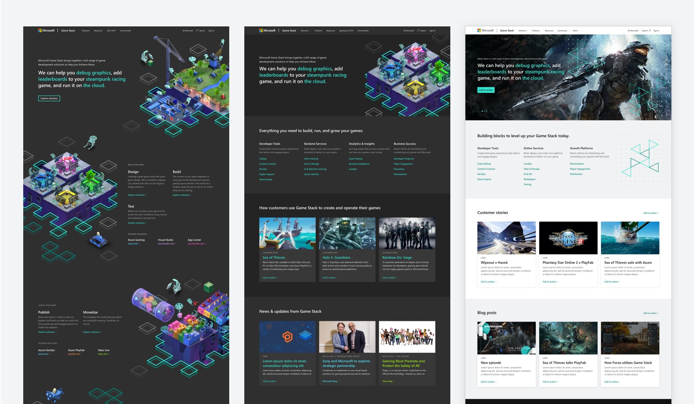
Game Stack website phase 1 overview
With the structure and content ironed out after feedback from a round of user testing, it was time to apply the new game art and visual language to the website. We were working on condensed timelines and with limited resources, so the scope of this initial phase was on the smaller side.
Home page
Detail view of the home page. I also helped develop conceptualize and write the hero messaging, alongside the marketing team.
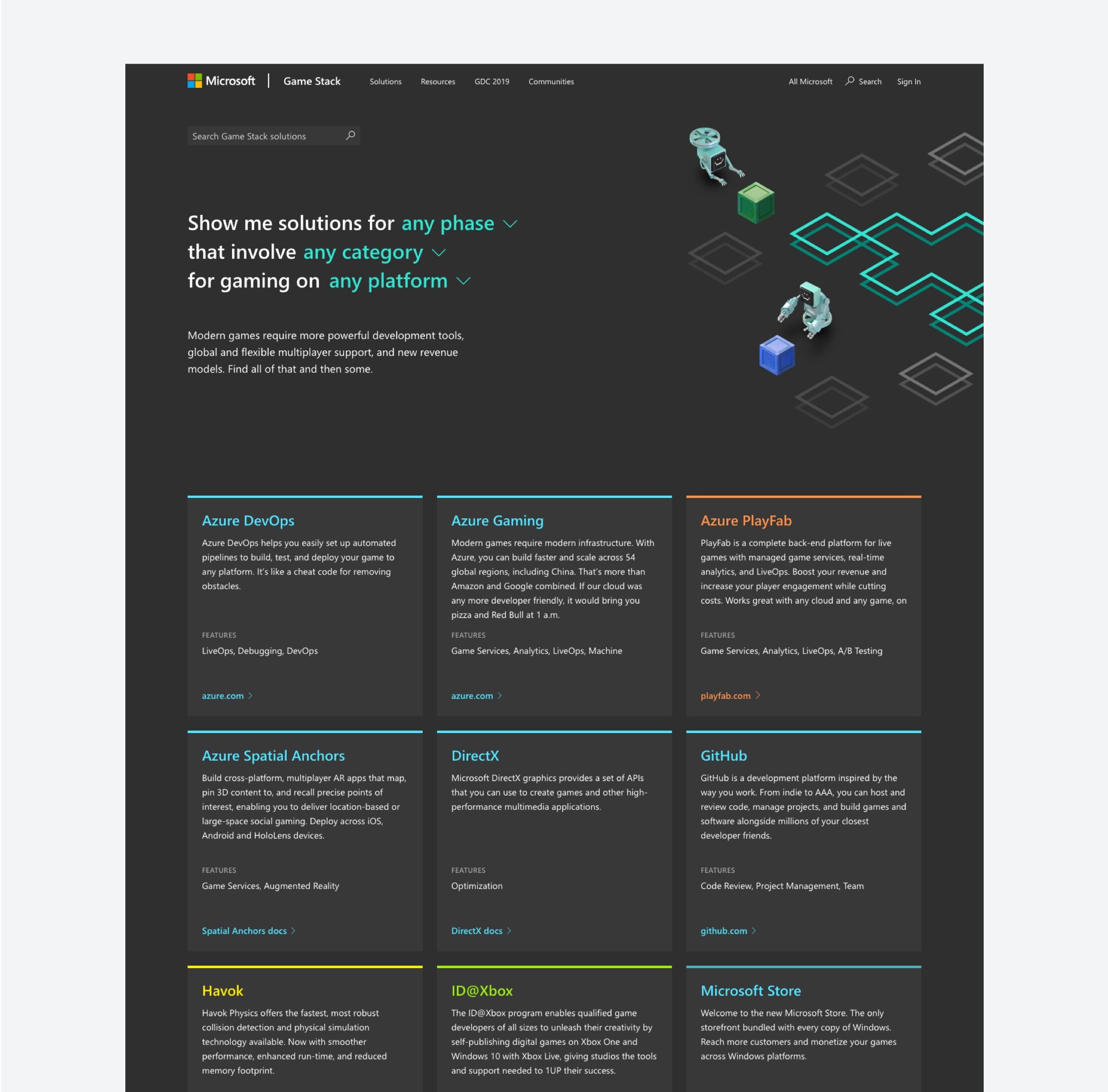
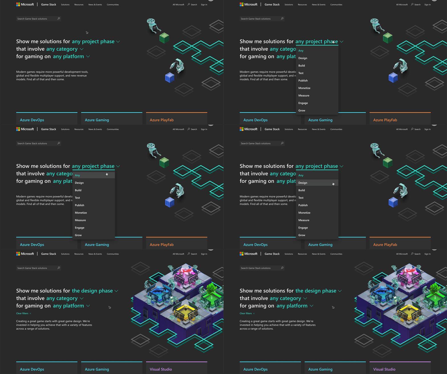
Solutions page
This was a portal to showcase the wide range of solutions that we offer to game devs, showing a brief overview before linking out to their respective domains. I conceptualized hero messaging/filtering mechanism based off of the homepage hero.
Style guide
A quick UI kit built for design efficiency, consistency, and dev handoff.
Phase 2
Customer journey
We continued to develop new content for the site, so I created a chart to reflect the new customer journey through the new content types. Based on learnings from the previous version of the site, we wanted to shift the focus from “phases” into customer stories and specific solution categories.
Site map
An update to the sitemap accounting for the new content types and primary customer journeys, showing the routes between pages, and a basic overview of the content that would live on each page. Used for alignment with stakeholders and dev.
Wireframes
Since we were updating the IA of the site, and had created new content types, I created another round of wireframes for stakeholder alignment and feedback.
Phase 2 overview
Visual language applied to the new site structure. I took a more utilitarian approach to the structure in order to efficiently get our game dev customers to the information they were looking for.
Home page detail
Pivoting from the phase-based journey to a focus our list of solutions categories, and surfacing customer stories as a way for other game devs to see how studios use Game Stack to build and run their games. We decided to create a straightforward and quickly skimmable list of links to our solutions categories, which helped provide a brief overview right out of the gate, and freed up homepage real estate to promote our customer stories higher up in the experience, since we learned that our audience was very interested in that content.
Solution category detail
A new page type, organizing our solutions by category rather than phases.
Phase 3
IA diagram
As we continued to develop our site, customer journey, and content strategy, I updated the ecosystem map to reflect our new approach, and align with stakeholders.
Site map
As we were increasing the number of pages being built, I wanted to have a basic overview to track and communicate what was being rolled out and where it would live on the site.
Site flow
A slightly higher fidelity version of the sitemap that better communicates the content of each page and the ways to travel between each area of the site.
Wireframes
Another round of wireframes reflecting the updates to the site.
Style guide
As a slight strategic adjustment, we wanted to pivot the look and feel of the Game Stack brand to align more with the overall Microsoft brand.
Phase 3 site overview
The new visual language applied to the site.
Home page detail
I was also involved in the development of our new visual language. We wanted to shift from our custom game art into showcasing the games that were built utilizing solutions from Game Stack. We needed a new take on the visuals that could better accommodate artwork from real games and studios.
Product page detail
We also wanted to create landing pages that focused specifically on the game development solutions from some of the larger products that offered a wider variety of solutions outside gaming, so game devs could have a hub to explore and refer to.
Game over?
Although our journey together has ended, the Game Stack site continues onward into new territory…
Credits
Nick Robinson, Design Manager / Kim Stair, Dev / Randy Hyunh, Visual Design / Dalila Copeland, Marketing Design / 3AM, 3D art


